Pages tools and getting more out of your images
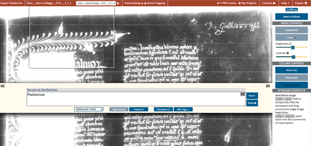
Page tools - CSS3 to the rescue The page tools split screen was developed to take advantage of CSS3 image manipulation tools. The reason was that while we allow access to 4000+ manuscripts the vast majority of our traffic is private uploads. And those uploads are invariably the poor quality of microfilm scans or photocopies of such scans or even photos taking in poor lighting with handheld cameras and phones. While is wonderful to be able to use the high quality images of repository we all know that such images are not an option because of availability cost or the resources of the intuition.
While there are a wide variety of image manipulation tools available through CSS3 (although not all browsers support it - we’re looking at you Safari) we quickly narrowed it down to four tools - invert, gray scale, brightness and contrast. We had originally used these tools in our brokenbooks.org project in the a custom Mirador IIIF viewer. (We were very excited that the mirador group has taken that work into the mirador viewer and even expanded it).
To select from the image manipulation options in T-PEN established a number of very simple criteria. Which tools would be the easiest to understand for the user and which of those had the potential to most often give useful results. most tools failed one of these two but passed the other. Taking curves and channel mixing for instance which can give great results in photoshop but a familiarity with those kinds of approaches to image manipulation is required and can be quite a learning curve to master. We could assume that users would come in with an understanding of such things nor should they have to.
These two simple principles did give a short list very fast - invert, gray scale, brightness and contrast. All four pass the first principle easily but the second one is a little more challenging. That is because by themselves they have limited utility. However these four tools work extremely well together. So much so that brightness and contract have almost always been presented together as a combined tool in image manipulation apps for instance. Invert is a surprise for many users. We forget the degree to which we are conditioned the codex. White page with black script. Some of us who are old enough to remember green screens do so so with fondness. White type on a black screen can be easier to read than black type on white. One must remember the human eye deals with projected light a little differently than reflected light. This is especially true if invert is used in conjunction with grayscale and a little brightness/contrast.
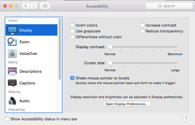
If you are on a mac go look at the accessibility options for your display in accessibility on your System Preferences panel because you’ll find invert, grayscale and contrast looking back at you. These represent the simplest way to improve readability. they are not always the best but not everyone has a photoshop guru to help them out.
In the manuscript world where text can often be faded brown on a tan background this combination of tools may surprise you.

